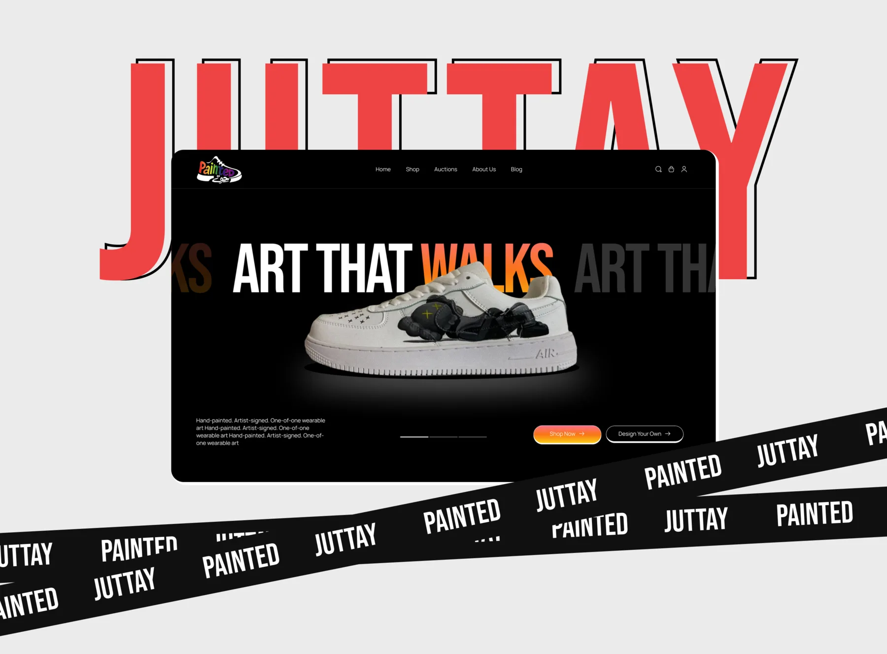
Home/Work/Painted Juttay — hand-painted juttis ecommerce
E-commerceEcommerceBrand-led UIVisual system

Painted Juttay — hand-painted juttis ecommerce

Brand-led ecommerce design for Painted Juttay — a Karachi label selling hand-painted juttis. Worked directly with the founder on IA, the product page, the checkout flow, and the visual system.

Year
2026
Role
End-to-end UI/UX designer · solo
Duration
Client engagement · multi-month
Platform
Web · Mobile responsive
Methods
Brand-led UI design · Information architecture · Product page architecture · Checkout flow
Tools
Figma
Painted Juttay store — homepage, product page, and cart screens.
00Overview

TL;DR.

Painted Juttay is a Karachi label that makes hand-painted juttis. Each pair is its own piece. The site had to feel like that — closer to a small craft gallery than a generic ecommerce template.

Problem
A hand-painted product can't be sold on a stock ecommerce template. Each pair is one of one, and the standard “grid of identical thumbnails” treatment flattens what makes the brand worth buying.
Approach
Worked directly with the founder, Muzammil, on the full design — information architecture, product page, checkout, and a visual system pulled from the juttis themselves rather than imposed on them.
Impact
A storefront that reads as a small painting gallery first and a shop second — without breaking the patterns ecommerce shoppers already trust (cart, filter, checkout).
01The brand

What Painted Juttay actually is.

Painted Juttay sells juttis — traditional South Asian flat shoes — that are painted by hand, individually. No two pairs are the same. The brand sits in that quiet intersection of craft and product: the thing being sold is a small piece of art, but the buying experience still has to be ecommerce-grade (cart, checkout, sizes, shipping).

Muzammil reached out to me to design the storefront. The challenge was honest from day one: how do you sell a one-of-one painted object inside a template language that was designed to sell ten of one t-shirt?

Painted Juttay — brand intro
The brand reference — colour, motif, and texture pulled straight from the work itself.
02The brief

What we agreed to ship.

We scoped to what mattered for launch:

01
A homepage that does the brand's job

Lead with the work, not the discount. The first thing a visitor sees should be the painting, not a banner.

02
A product page built for one-of-one items

When stock = 1, scarcity is the dominant constraint. The product page had to communicate that without screaming 'BUY NOW' in red.

03
A checkout flow that respects the price tag

Hand-painted juttis aren't impulse purchases. The checkout had to feel trustworthy, not transactional.

04
A visual system pulled from the product

Colour, type, texture — everything derived from the juttis themselves so the site felt of the brand, not stamped on top of it.

Painted Juttay — homepage design
The homepage — painting first, navigation second, discount banner nowhere.
03Information architecture

Catalog decisions for a one-of-one product.

The IA question that drove everything else: how do you let someone browse when every item is unique?

Traditional ecommerce IA assumes categories (men/women/sale) and attributes (size, colour, brand). For Painted Juttay, "colour" doesn't mean what it means at Zara — every pair has many colours, and the arrangement of those colours is the product. The categories collapse, the filters lose their grip.

Before
Generic ecommerce IA (rejected)
Men / Women / Sale
Filter: size, colour, brand, price
Grid of identical thumbnails
After
Painted Juttay IA
Shop · all available work, browsable as a gallery
Filter: motif, palette mood, size — not brand or category
About — the painter's hand visible, not a 'company' page
Care · how to look after a hand-painted pair

The shift from colour filter to palette mood was the small move that did the most work. Shoppers can't filter on "the specific colourway of this pair" — but they can filter on warm / cool / earthy / monochrome. That maps to how people actually shop for art.

Painted Juttay — shop / gallery page
The shop reads as a gallery — palette-mood filter on the left, every pair its own card.
04The product page

Where the painting has to win.

The product page is where every ecommerce site either trusts the product or doesn't. For Painted Juttay, the painting had to fill the viewport before any UI did.

Product page design — painting first, scarcity stated plainly
Painting first
Hero image fills the column. Multiple shots of the same pair from different angles — top, side, sole — because a painted object reads differently from different angles.
'One pair available'
Scarcity stated in plain language. No timers, no 'selling fast' pressure copy — the truth (stock: 1) is enough on its own.
The painter's notes
A short caption from the painter on each piece — what the motif is, what inspired it. Replaces the generic 'product description.'

The decision not to add a countdown timer was an active one. Pressure tactics work for fast-fashion impulse buys; they undercut craft positioning. Stock: 1 is its own scarcity signal, and trusting the viewer to read it kept the brand intact.

Painted Juttay — product page detail variants
Detail variants — angle shots and motif close-ups inside the same product page composition.
05The visual system

Pulled from the juttis, not imposed on them.

Every token in the design system has a defensible origin in the product itself. Colour pulled from recurring motifs in the painting work; typography paired to feel handwritten without being literal; component shapes echo the soft curves of the jutti silhouette rather than the right angles of a default UI kit.

New tokens added (7)
colour/canvas
warm off-white
colour/ink
deep brown — matches outline paint
colour/accent
jutti red — pulled from a recurring motif
colour/gold
reserved for one-of-one labels
type/display
serif — feels written, not typed
type/body
humanist sans — keeps long-form readable
radius/card
20px — softer than default, matches jutti curve
Reusable components (5)
ProductCard
gallery + collection screens
OneOfOneBadge
gold-leaf badge on every available pair
PainterNote
caption block on product page + about
PaletteMoodFilter
gallery filter — warm / cool / earthy / monochrome
CareNote
shipping + product page reassurance copy
Painted Juttay — full system applied across screens
The system applied — every screen composes from the same components, same colour tokens, same type pairing.
Painted Juttay — cart and checkout
Cart and checkout — trust signals (care, shipping, painter note) carried through to the boring screens.
06Reflections

What worked, what I'd carry forward.

What worked
  • Designing the system from the product up — colour and type derived from the juttis themselves — meant every screen felt of the brand without anyone having to manually theme it.
  • Replacing 'colour filter' with 'palette mood' was the IA decision I'm proudest of. It changed the shop from 'find your size and pattern' to 'find your taste.'
  • Working directly with Muzammil meant decisions moved fast. No translation layer, no design-by-committee.
What I'd do differently
  • I'd push for actual product photography earlier in the design process. Stand-in placeholders during design make it easy to over-engineer the UI; once the real shots arrived, several layouts wanted to simplify themselves.
  • The cart-to-checkout transition deserved one more pass. It's clean but it's the most 'template' moment in the site, and a hand-painted brand should keep texture in even the boring screens.
  • Future: a page that walks through how a pair gets painted — the brand's strongest story isn't on the site yet.

Excellent creativity with exceptional communication skills that led to timely delivery of the project. Recommend.

Muzammil Ahmed
Muzammil Ahmed
Founder · Painted Juttay

If you're building an ecommerce surface — one that needs to feel of the product instead of stock-template generic, and needs to read intentional at every breakpoint — this is the work I scope as responsive web design. Bring the brand, I'll bring the system.

FAQ

On this case study.

  • Painted Juttay is a Karachi-based label that sells juttis — traditional South Asian flat shoes — painted by hand, individually. Every pair is one of one; no two are the same. The brand sits in the intersection of craft and product: the thing being sold is a small piece of art, but the buying experience still has to be ecommerce-grade (cart, checkout, sizes, shipping). Founder: Muzammil Ahmed.

  • End-to-end UI/UX designer, solo. I worked directly with Muzammil on the full design — information architecture, homepage, the product page built for one-of-one stock, the checkout flow, and a visual system pulled from the juttis themselves. No design-by-committee, no translation layer between founder and designer. Multi-month engagement across 2025–2026.

  • Two specific moves. First, I rejected the standard category IA (men / women / sale) and the standard attribute filters (size, colour, brand) — they collapse when every item is unique. The shop reads as a gallery instead, with filters by motif, palette mood (warm / cool / earthy / monochrome), and size. Second, the product page leads with the painting, not the buy button — multiple angle shots, the painter's notes in place of generic copy, and 'one pair available' in plain language. No countdown timers, no pressure copy; stock-of-one is its own scarcity signal.

  • Figma — homepage, gallery, product page, cart, checkout, and the full visual system (colour tokens pulled from recurring motifs in the painting work, type pairing chosen to feel handwritten without being literal, component shapes echoing the soft curve of a jutti). One file, one design system, every screen composing from the same components.

Available now · 1 slot open

Got a flow that needs to ship?

Or email me
Based in
Karachi, PakistanUTC+5