TL;DR.
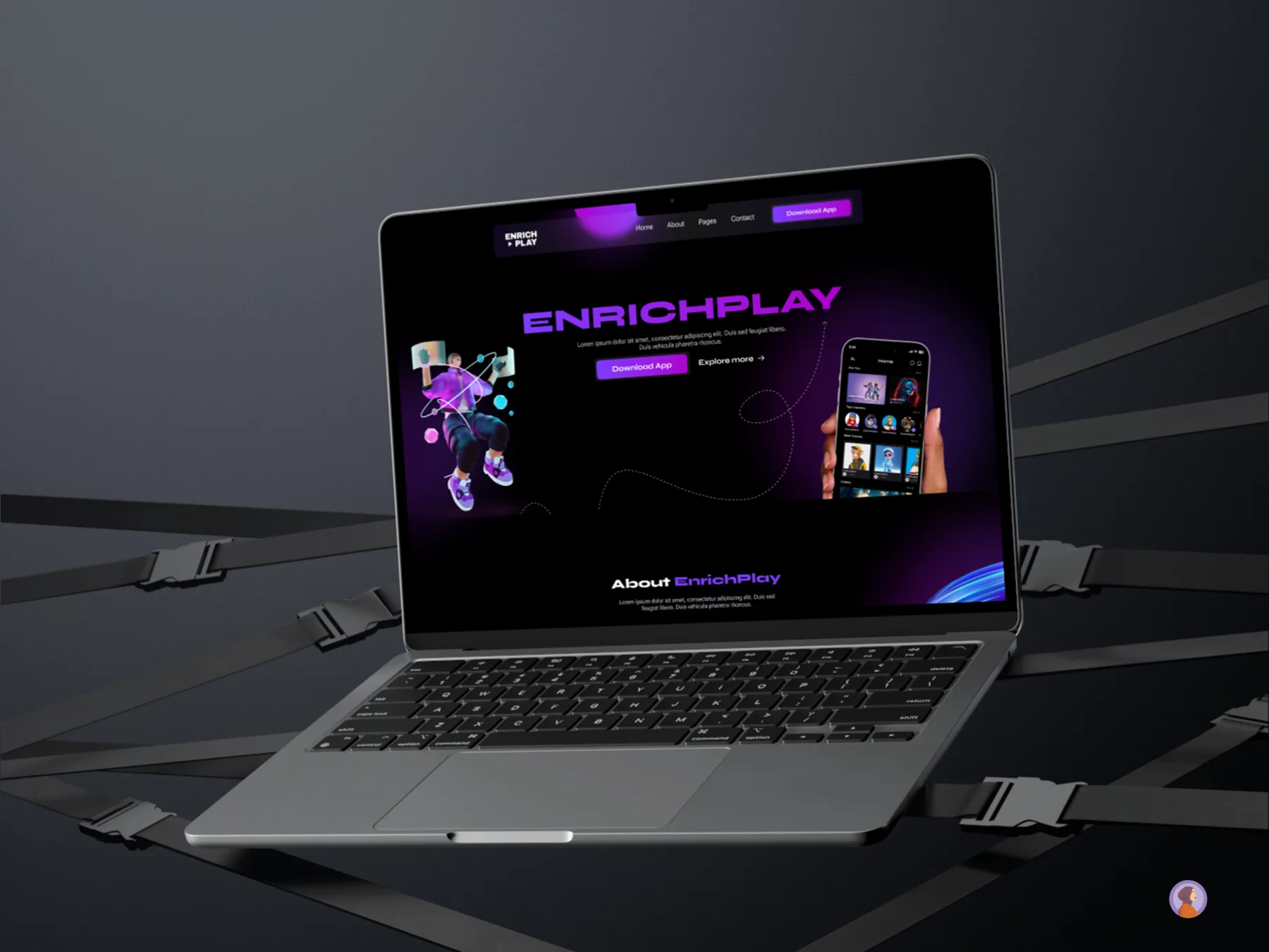
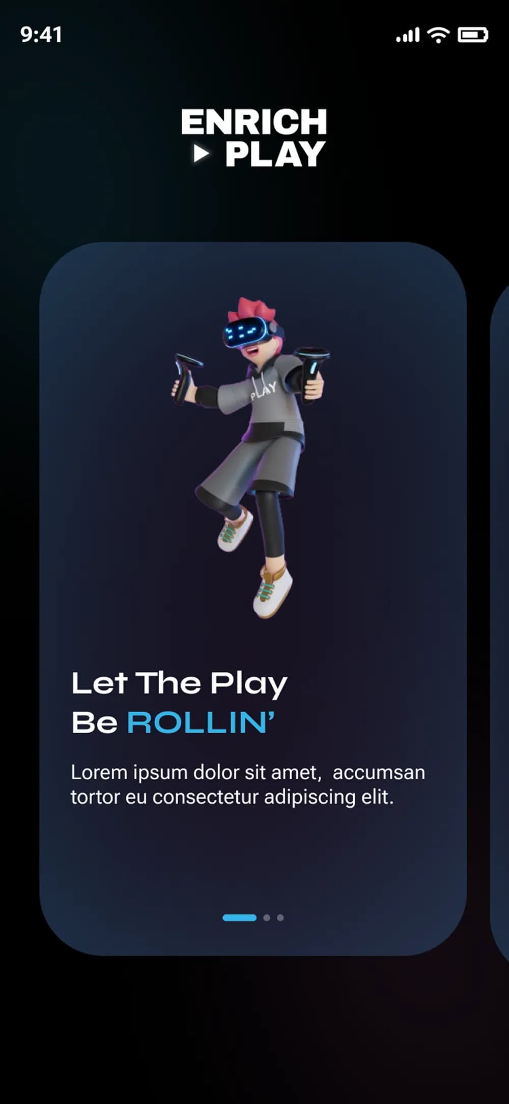
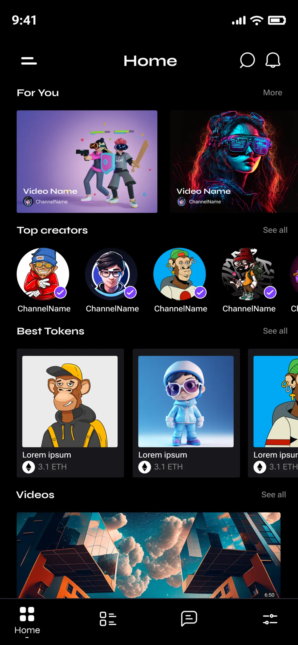
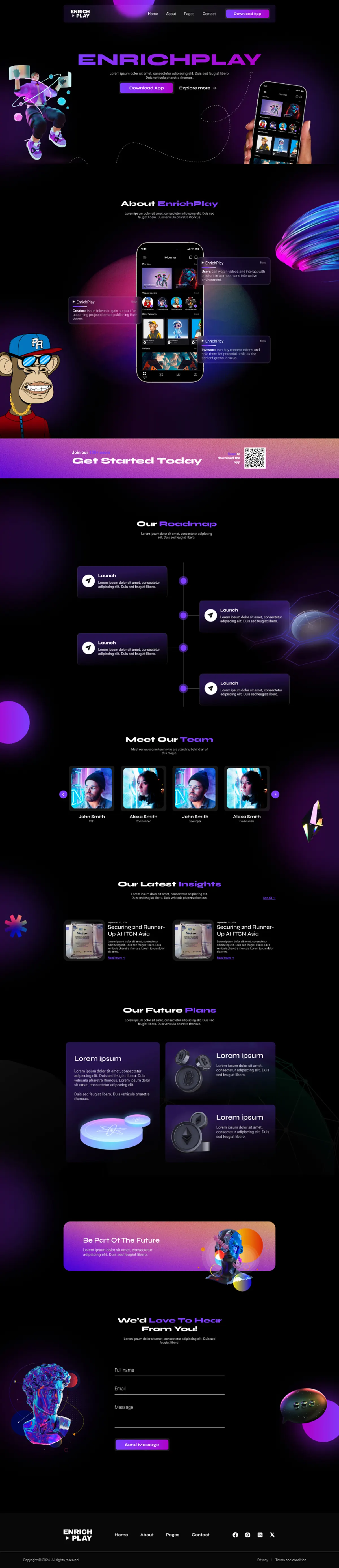
Enrichplay is a crypto product Abdul Ahad Magsi is building. He came to me with the idea — I designed the UI/UX across mobile and responsive web, with one shared visual system holding both surfaces together.
Who Enrichplay is.
Enrichplay is Abdul Ahad's crypto product. He came in with a clear vision — the concept, the positioning, the user he was building for — and needed someone to translate that into a real product surface. That's the role I took: UI/UX designer, end-to-end, working with the founder rather than around a translation layer.
Crypto products are unusually hard to design well. The category trades on trust, and the visual conventions of the category fight against that trust on every screen: dense data, intimidating numbers, a default vocabulary that assumes you already know what a private key does. The brief, in one sentence, was make this feel like a product someone wants to use, not a dashboard someone is afraid of.
What we agreed to ship.
Mobile-first design that holds its shape on responsive web. Not a 'mobile site' and a 'desktop site' — one product, two viewports.
Tokens, components, and patterns that scale. The deliverable is the system; the screens are evidence the system works.
Design for the user who is two months into crypto, not the user with a Ledger on their desk. Keep the surface readable without dumbing the product down.
Most crypto UIs choose between 'playful' (which undercuts trust) and 'institutional' (which alienates). The brief was the narrow middle.

Building the language before the screens.
I built the system before designing any individual screen. That order matters: when the tokens and components exist first, every screen afterwards is just a composition — and composition decisions stay inside the system instead of one-offing every layout.
The two density tokens (spacing/density-mobile vs density-web)
are the small move that did the most work in the system. The same
component renders comfortably tight on a 375px phone and comfortably
loose on a 1440px desktop without the designer having to remember to
respace anything. The system handles the breakpoint, the layout
inherits.
Where the system meets the product.
The number is the answer to the question the user came in with. Tabular figures so it doesn't reflow mid-update.
Always within glance-distance of the amount — different chains, different totals. Cuts the most common confusion in crypto UIs at the root.
Send / Receive / Swap sit where the thumb is, not where a desktop user's eye is. Bottom-anchored on mobile, side-rail on web.
Identical card and row components from the mobile build — the web version is the same system, breathing.
On a wider viewport the transaction history sits next to the balance instead of below it. Same rows, two-column composition.
ActionRail moves from bottom of viewport to the left edge — mouse expects it there, thumb doesn't.
What changes between mobile and web, and what doesn't.
The principle I held throughout: the components don't change between breakpoints — the composition does. A balance card on mobile and on web is the same component, with the same internal hierarchy. What changes is what sits next to it.
One thing at a time. ActionRail at the bottom. Compact density tokens. Critical information always above the fold.
Dashboard splits — balance and quick actions left, transaction history right. ActionRail migrates to a side rail. Spacing tokens loosen.
Adds a portfolio overview alongside balance + history. Same components, third column composition. The product becomes a “tool” rather than just a “wallet.”
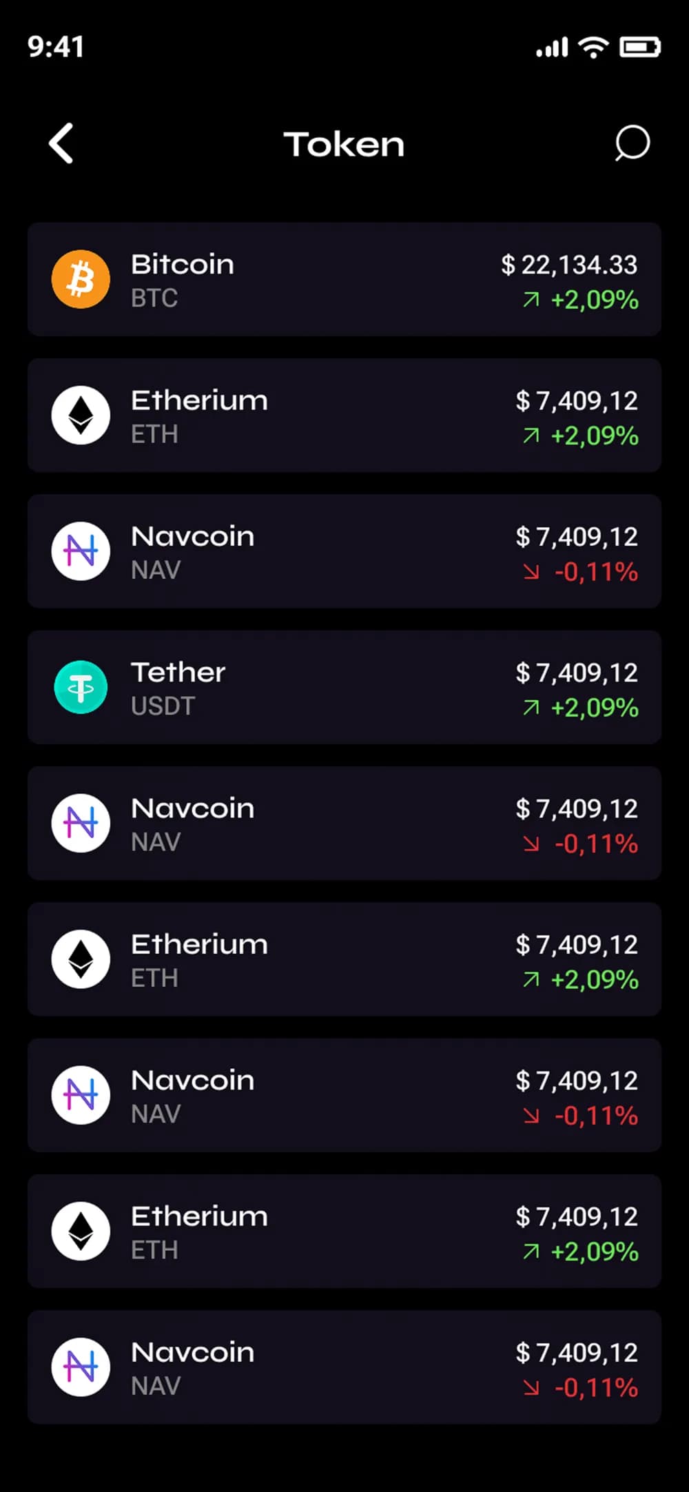
The hardest call across breakpoints was the transaction list. On mobile, every row needs to feel like a complete unit — amount, recipient, status, time. On web, the same row can give up a column to the surrounding context. I held the row identical across both and let the frame around it carry the difference. Less to debug, less to maintain.
What worked, what I'd carry forward.
- Building the system before the screens. Every screen after the first three composed itself out of components that already existed — fewer one-offs, faster iterations.
- The two density tokens (mobile vs web) carried more weight than I expected. One component, two breathing room states, zero custom layouts.
- Working directly with Abdul Ahad meant trade-offs got decided quickly. He knew what was core to the product idea and what was negotiable — and that clarity translated into design momentum.
- I'd prototype the Send flow in something interactive before locking the chunked-vs-single-screen call. A static figma comp is the wrong way to test a multi-step money flow.
- The light-mode variant was scoped late. Designing dark-first then porting is workable, but I'd rather build both surfaces in parallel next time so the contrast decisions are honest from the start.
- A motion spec for screen transitions would have helped the engineering hand-off — animation is the part of the system most likely to drift in implementation.
Exceptional work by Masfa. I had the pleasure of collaborating with her on Enrichplay where she brilliantly crafted the UI/UX design for my idea. Her creativity and attention to detail truly brought the concept to life. If you’re looking for someone who can transform visions into visually stunning realities, Masfa is the designer you need.

The piece this work hinges on — one component library, two density tokens, the same product on every surface — is what I scope as design systems and Figma libraries. If you're staring at a product that has drifted across breakpoints and platforms, that's the engagement to start with.
On this case study.
Enrichplay is a crypto product built by founder Abdul Ahad Magsi. He came in with a clear vision — the concept, the positioning, the user he was designing for — and needed the UI/UX translated into a real product surface that works on a phone and on the web. The brief, in one sentence, was to make this feel like a product someone wants to use, not a dashboard someone is afraid of.
UI/UX designer, solo and end-to-end. I worked directly with Abdul Ahad — no agency layer, no translation step — across onboarding, dashboard, send/receive, swap, and account flows. The deliverable was a unified visual system: tokens, a component library, and patterns that scale, plus the screens that act as evidence the system works. Engagement ran across 2024–2025.
One component library, two density tokens. The same AssetCard, BalanceHeader, TxRow, and ActionRail render on a 375px phone and on a 1440px desktop without bespoke layouts at each breakpoint — the components don't change, the composition around them does. Mobile uses compact spacing (8/12/16/24) and a bottom-anchored action rail at thumb level; web uses looser spacing (12/16/24/32) and the same action rail migrated to a side rail at the left edge. The principle was that the system handles the breakpoint and the layout inherits.
Figma — tokens, components, screens, and breakpoint variants all in one file. The deliverable was a system, not a deck: design tokens for colour, type, density, and radius; a component library for AssetCard, BalanceHeader, TxRow, NumberBlock, ActionRail, ConfirmSheet, and NetworkBadge; and mobile + tablet + web compositions showing how each component breathes across viewports.