Dome
A property discovery app that takes people from just looking to moving in.
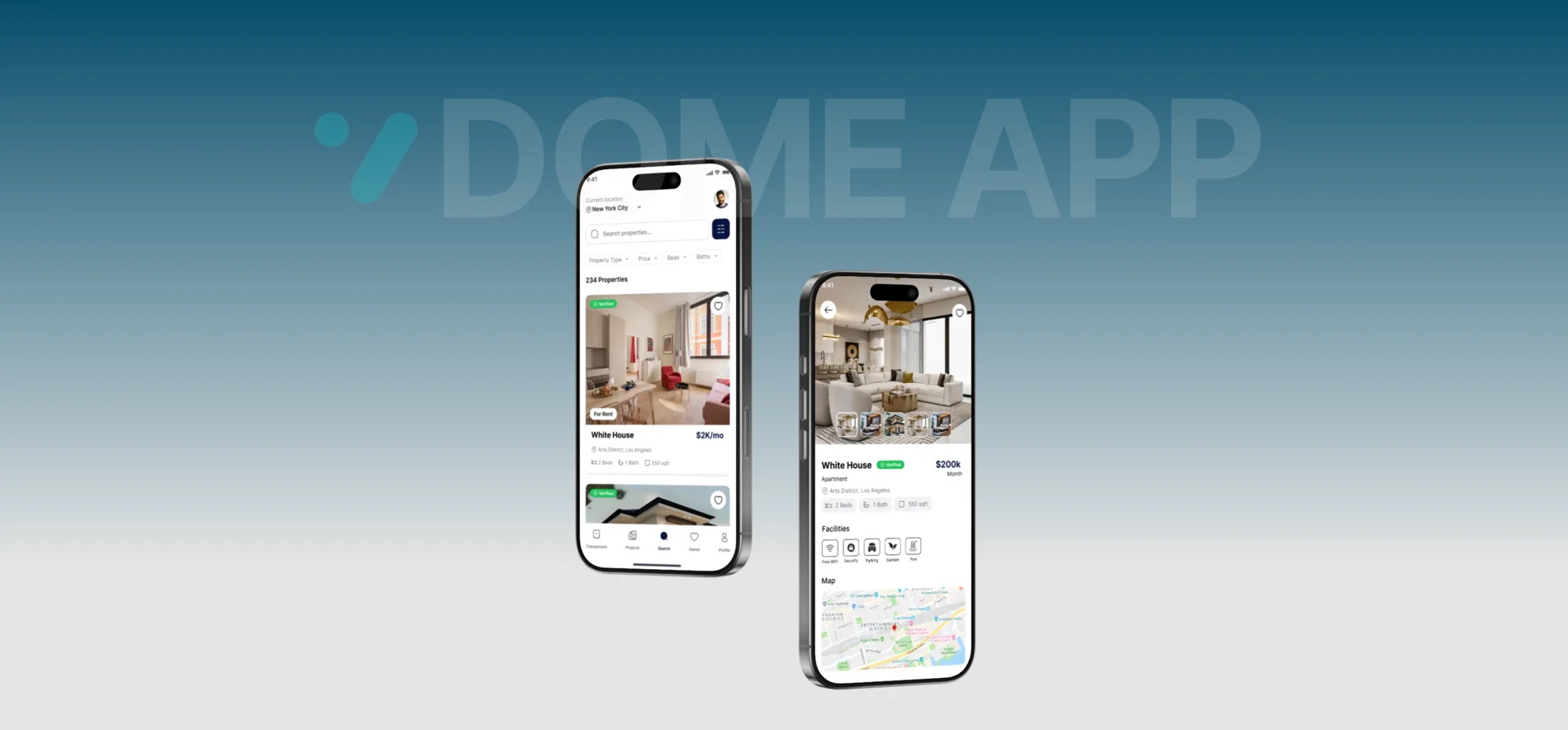
A calmer way to find a home.
The full journey, from browsing to booking.
Dome helps people search, compare, and settle on a new place, from renting a studio to buying a family home.
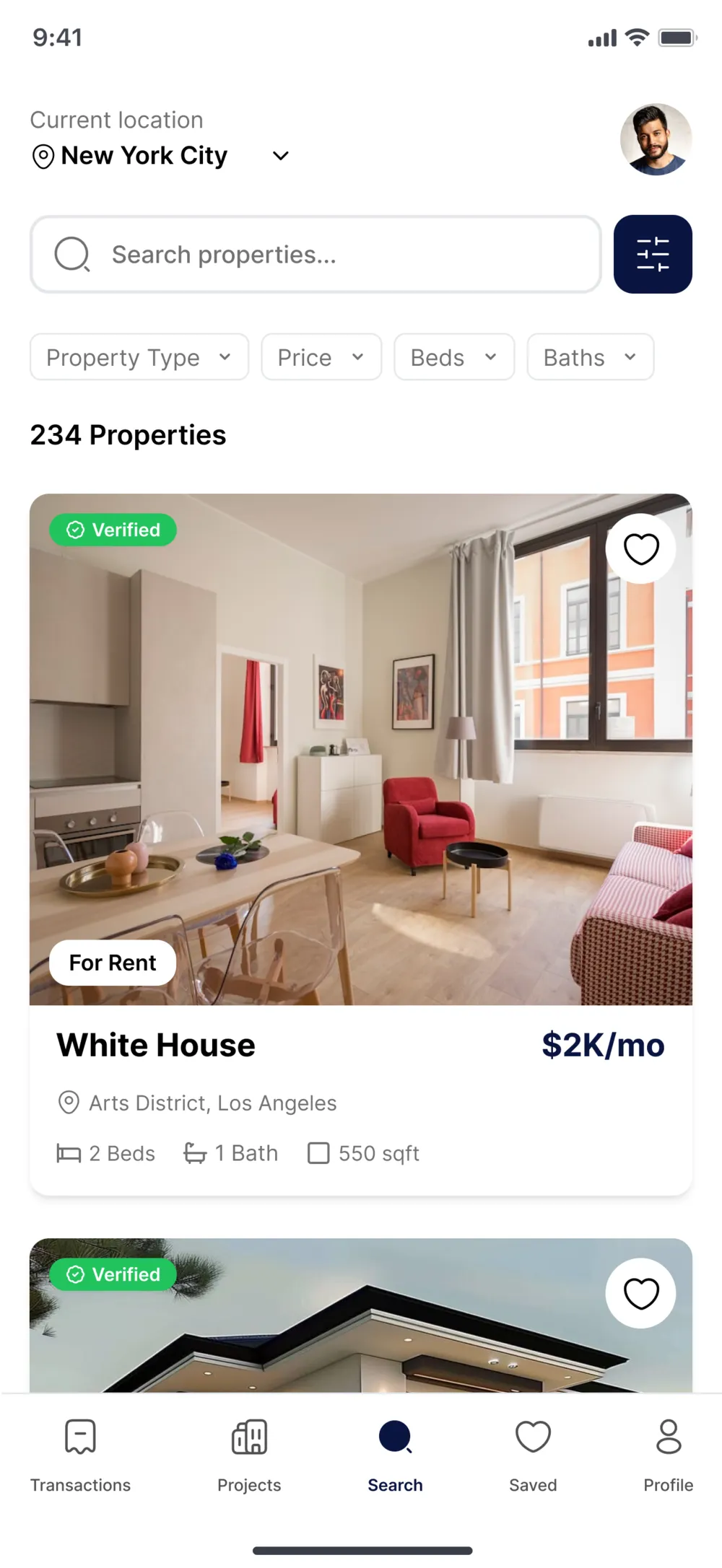
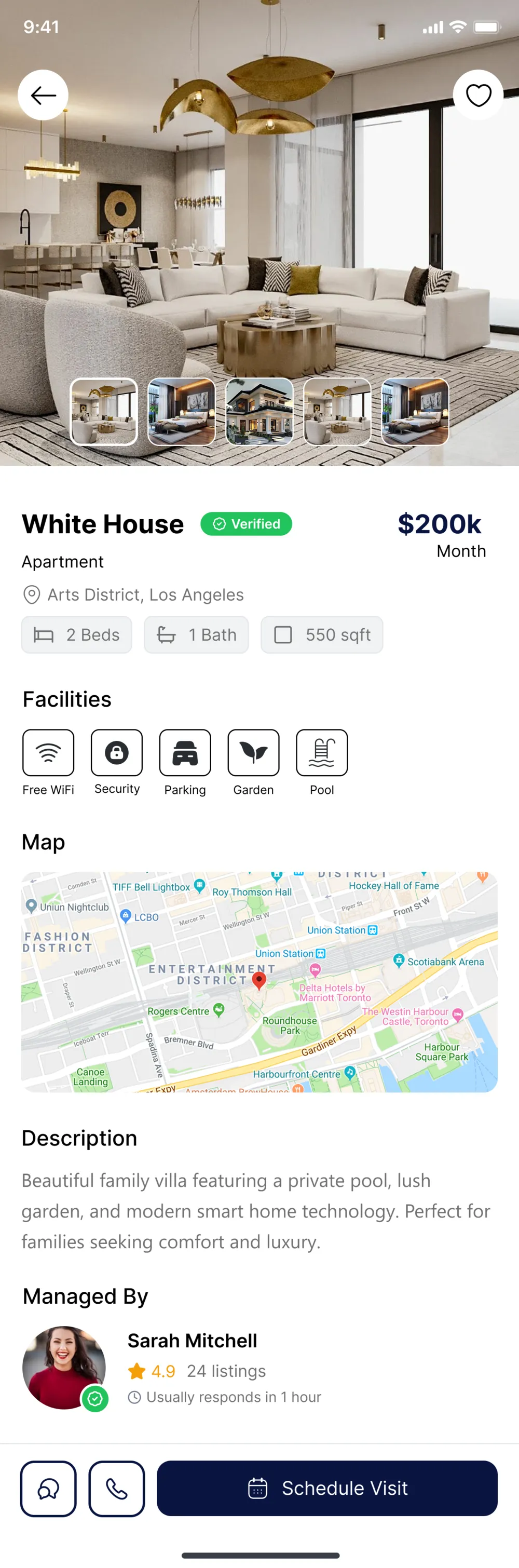
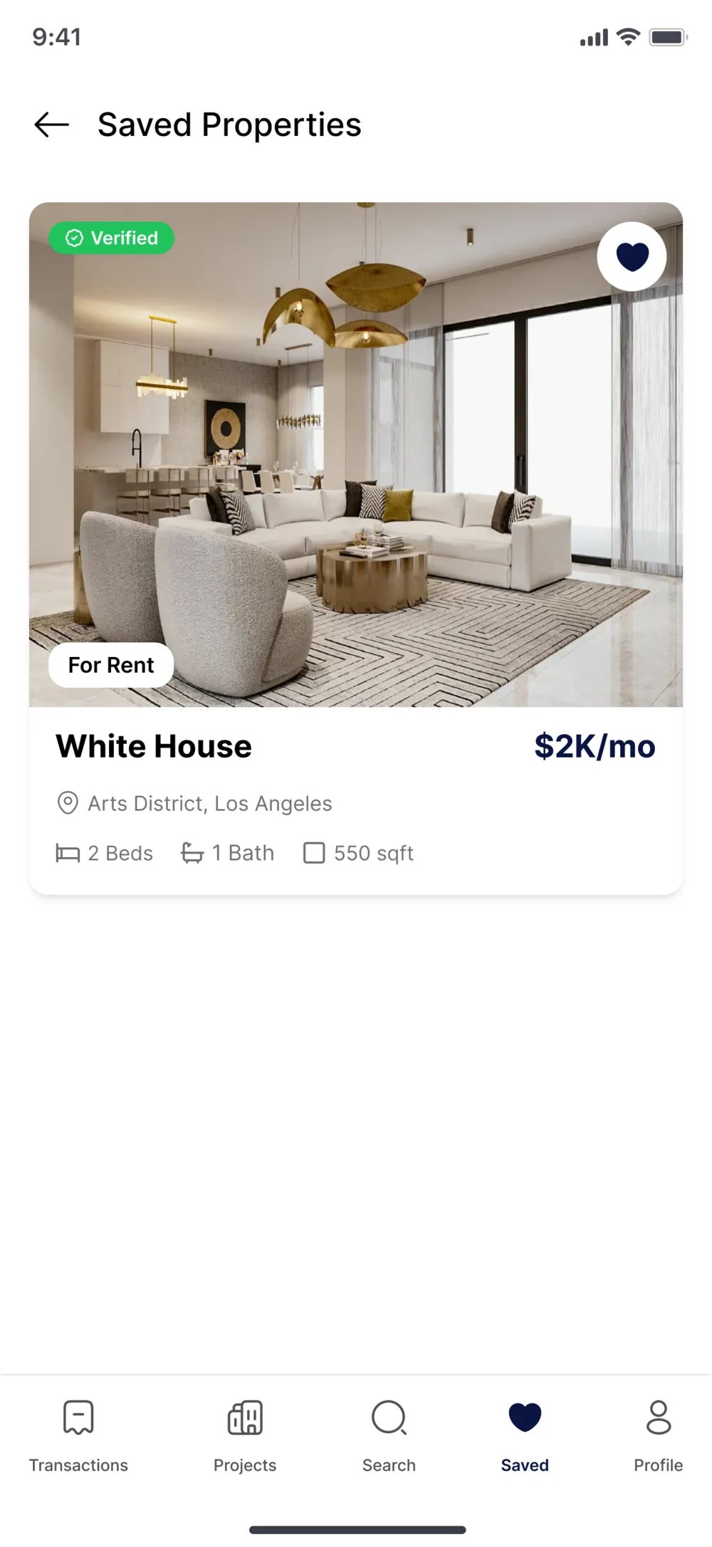
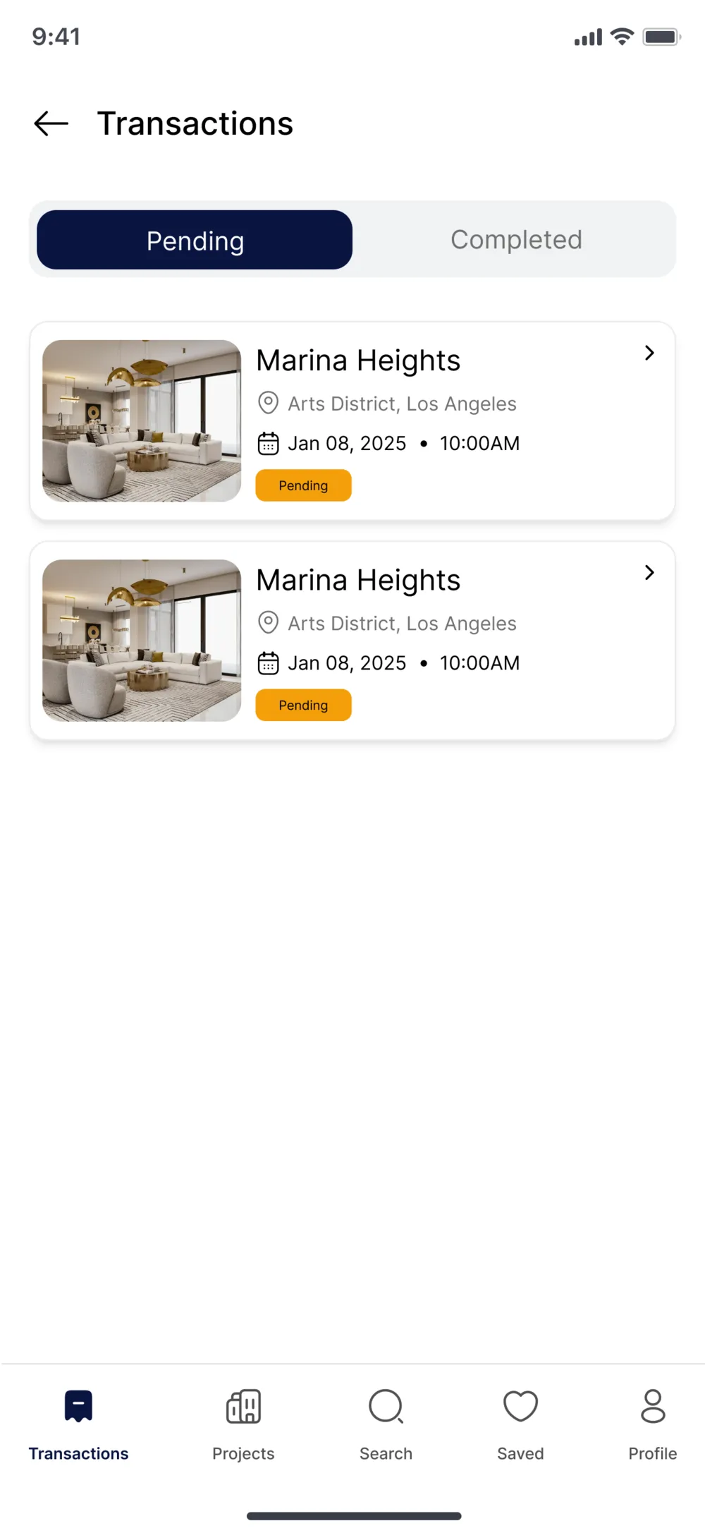
It covers the full journey: discovery, filtering, detailed listings, saved favourites, and transaction tracking from pending to completed.
Research, then flows, then finish.
Research
Looked at how people actually search for a place today, and where existing property apps slow them down or lose their trust.
UX Design
Mapped every core flow (search, filter, save, view, book) and solved the friction before deciding on a single visual detail.
UI Design
Built a clean, confident visual language where trust and clarity feel automatic, so people move fast without second-guessing.
Turning findings into decisions.
Problems
Every listing looks equally credible, or equally risky, with no way to spot a verified property at a glance.
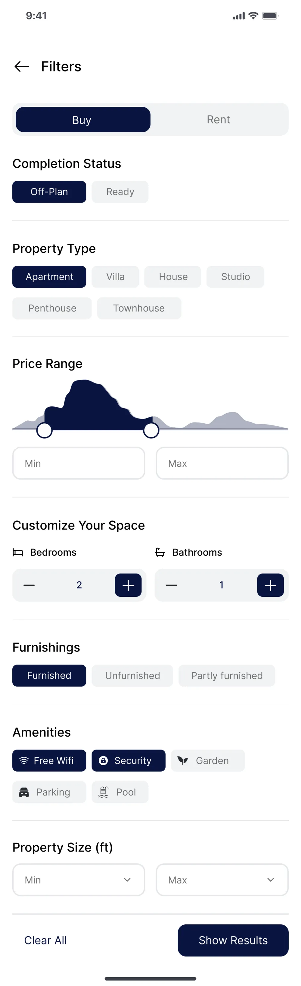
A long filter list up front slows people down instead of helping them narrow in on what matters.
Splitting Buy and Rent into separate journeys doesn't match how people actually shop for a place.
Solutions
A clear green Verified tag surfaces trustworthy listings before anything else on the card.
Budget, bedrooms, and move-in date lead the filter panel. Everything else lives one tap away under More filters.
Buy and Rent sit as a single toggle inside one search experience, not two separate apps.
Trust and clarity, made systematic.
Poppins carries the headings, Inter handles body and UI text. A navy and teal core stays calm, while three semantic colours do real work: green for verified, amber for pending, red for alerts.
Find your next home.
ABCDEFGHIJKLM · abcdefghijklm · 0123456789
Budget, bedrooms, and move-in date lead the filter panel, so the essentials come first.
ABCDEFGHIJKLM · abcdefghijklm · 0123456789
Short by design.
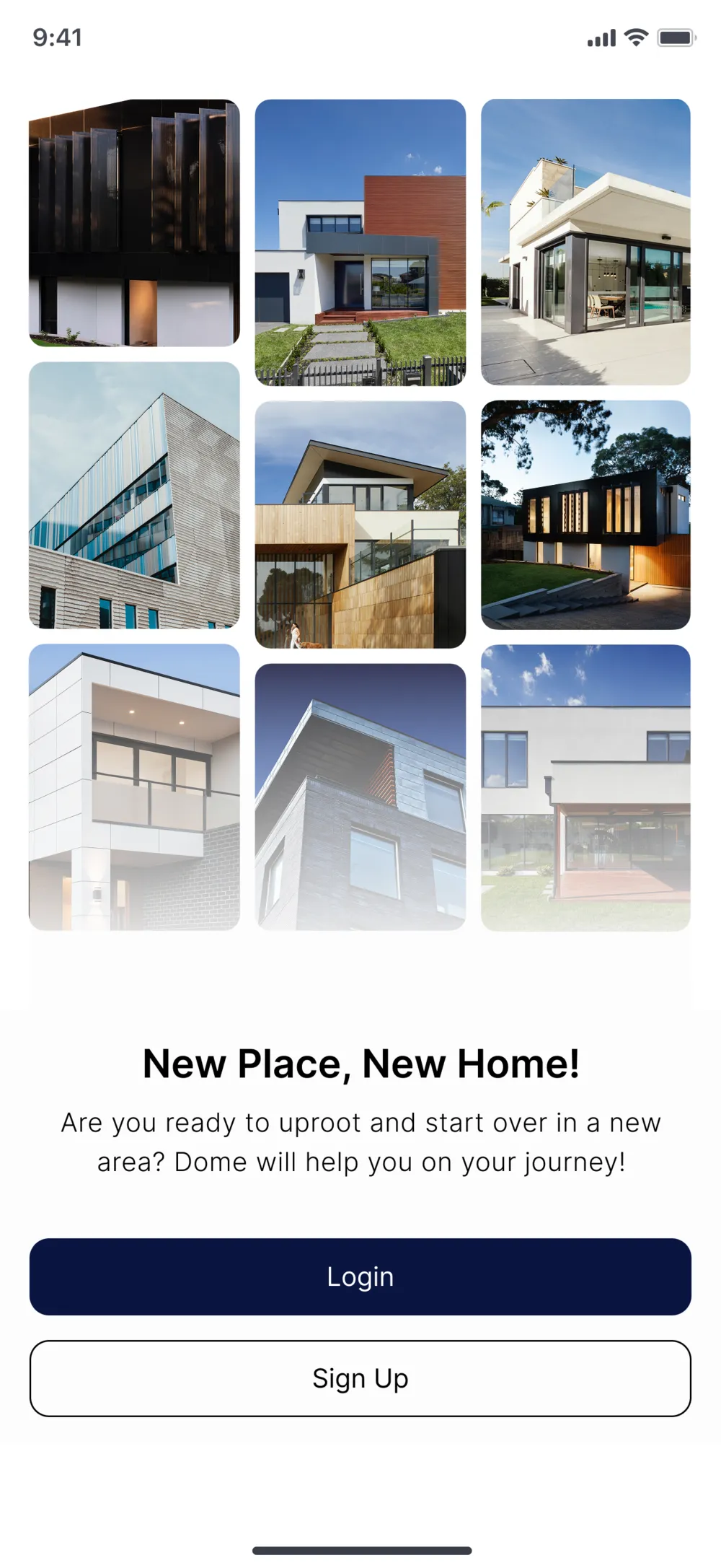
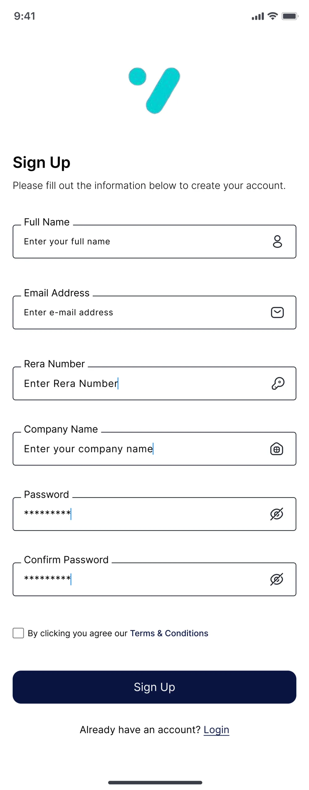
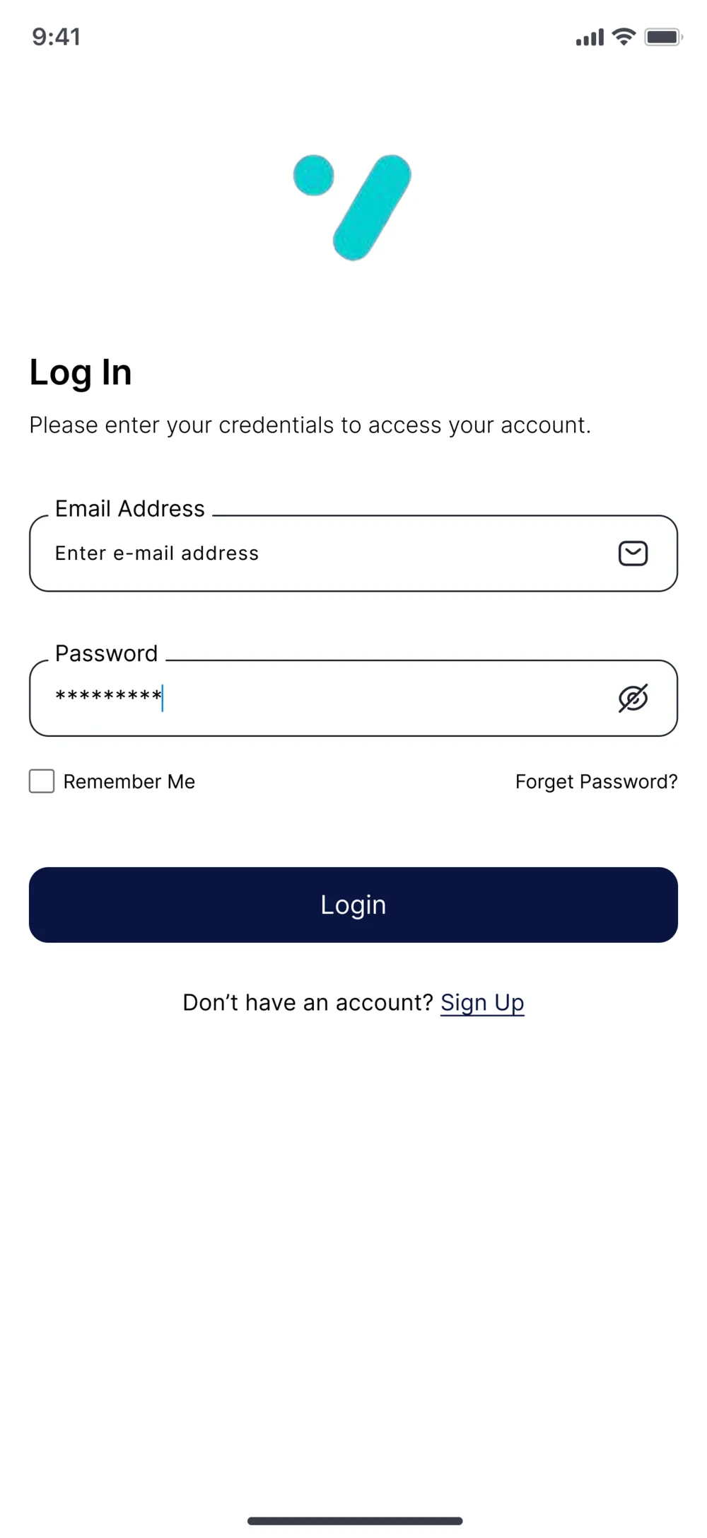
Sign up, log in, and account recovery, kept short so people reach the listings as fast as possible.
Search, compare, save, track.
The loop people move through, from the first search to booking a viewing and tracking the deal to completed.