The Shopify checkout: where the default theme stops being a UX problem and starts being a conversion problem
Shopify's default theme converts adequately, not well. The gap between adequate and well sits in four specific moments — cart drawer vs. page, the shipping calculator, express checkout placement, and the post-purchase page that decides repeat-customer rate. Here's what each of those decisions actually does to revenue.
A founder I was on a call with last quarter pulled up his Shopify dashboard and said: "We're at 1.4% conversion. The site looks good. The product is good. What's the lever?" He'd already tried two of the usual fixes — a sticky add-to-cart on product pages, a free-shipping threshold pinned in the header. Both had moved the needle by half a point combined. Below that, he was stuck.
I asked him to open the default Shopify checkout in his browser and walk me through a real purchase. The first issue surfaced within ninety seconds. The cart icon in the header opened a drawer. The "view cart" link inside the drawer opened a full cart page. The "checkout" button at the bottom of the drawer skipped the cart page entirely and went straight to step one of checkout. Three paths to the same place, two of them subtly different, none of them clearly the canonical one. Most of his traffic was funneling through the drawer; the drawer didn't surface the shipping calculator; the shipping calculator was where his trust broke.
That ninety-second walk is a version of the same thing I see across most Shopify stores using a default or near-default theme. The native checkout is not bad. It's a remarkable piece of engineering — secure, performant, hosted, payment-method-agnostic. What it is, though, is a starting line, not a finish line. It's tuned to convert adequately across every product category Shopify has ever served, which means it under-converts in any specific category where one decision goes the other way.
This post is about four of those decisions. They're the ones I see costing stores the most conversion and the most repeat-customer revenue, and they're the four I'd start with if a founder asked me to scope an audit. The Painted Juttay case study is a custom build, not a Shopify store, but the principles are the same — the four moments below are where ecommerce conversion lives regardless of platform, and the Shopify default just happens to make a specific (and often wrong) choice at each one.
What the default theme gets right
Before the gaps: credit where it's due. The native Shopify checkout, especially since the One-Page Checkout rollout, gets several things right that custom builds routinely break.
- It's hosted. PCI compliance, fraud screening, and payment-method support all sit on Shopify's side. A custom checkout has to re-earn all of that, and most don't.
- It's responsive. The native checkout is one of the best mobile checkout experiences in commerce. Custom themes routinely break mobile cart in ways that take three QA cycles to catch.
- It supports Shop Pay. Returning Shop Pay users skip the form entirely. This is a meaningful conversion lift for any store with repeat traffic, and it's free.
- It localizes. Currency, language, and tax behaviour all auto-adjust. A custom checkout requires deliberate work for any of this.
Anyone telling you to rebuild the native checkout from scratch as a first move is selling you something. The four decisions below are about what you build around it — the cart layer, the trust layer, the express-checkout layer, and the post-purchase layer — not about replacing the checkout itself.
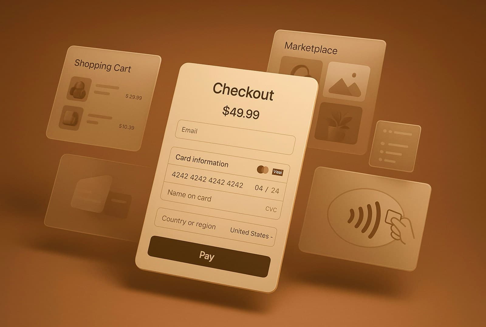
Decision 1: Cart drawer vs. cart page (and what most stores get wrong by shipping both)
The decision: When the user clicks the cart icon in the header, what do they see? A slide-out drawer? A full cart page? Both?
What the default theme does: Most modern Shopify themes ship a cart drawer by default. The drawer slides in from the right, shows the items, and has two CTAs — "view cart" (full page) and "checkout" (skip to checkout). The cart page exists; the drawer also exists. They sit in parallel.
Why this is a problem: Two parallel paths to the same destination is a Hick's Law violation in disguise (I walked through the law in detail in the Take Therapy booking post). The user has to choose between drawer-checkout and page-then-checkout without enough information to know which is faster. Most pick the drawer and skip the cart page entirely — which means any value the cart page added (shipping calculator, discount-code field, upsells, trust badges) never reaches them.
What to do instead: Pick one. There are two defensible answers, and they depend on the cart's job in your specific funnel.
- Drawer-only, for stores where the cart is a staging area (a few items, simple totals, fast move-to-checkout). Strip the cart page from navigation entirely. Surface shipping estimate, discount code, and any upsells inside the drawer.
- Page-only, for stores where the cart is a decision space (multi-item bundles, configurable products, shipping-cost comparisons mattering). The drawer becomes a confirmation toast — "Added to cart. View cart." — not a full UI.
The wrong answer is the one most stores ship: drawer and page, both fully featured, the user choosing between them every time. That's the path that quietly costs conversion because the drawer feels faster (so most users pick it) but the drawer is missing the trust signals the user needed (so they bounce at checkout).
The pattern I push for on most stores: drawer-only, with the cart page redirecting to the drawer. Faster to checkout, fewer paths to maintain, and every trust signal lands in the same place.
Decision 2: The shipping calculator moment — where trust breaks
The decision: When does the user see their shipping cost?
What the default theme does: Shipping is calculated on step 2 of checkout — after the user has typed in their email, name, and address. The cart shows a "shipping calculated at checkout" placeholder.
Why this is a problem: "Calculated at checkout" is the single most common abandonment trigger in ecommerce, and it's been the most common for at least a decade. Every shopper survey, including the Baymard Institute's running checkout-abandonment studies, puts unexpected shipping cost at the top of the list of reasons users bail. The Baymard number for 2025 was 48% — 48% of cart abandonments cited extra costs (shipping, tax, fees) as the reason. That's not a UX detail. That's the largest single conversion lever in any cart that hides shipping until checkout.
The trust pattern under this is straightforward: a user who sees a shipping cost upfront has the option to accept it or leave. A user who only sees it after typing their address into a form feels manipulated, regardless of whether the cost itself is reasonable. The cost isn't the issue. The timing of the cost is.
What to do instead: Surface shipping as early as possible, with three patterns to choose from depending on your catalog:
- Free shipping over a threshold. The cleanest pattern, if your margins support it. A sticky banner at the top of the cart shows "Free shipping over $X — you're $12 away." This converts the shipping question into an upsell prompt, and it works on mobile, drawer, and full-page cart alike.
- Flat-rate shipping by region. A "ships from $X to your region" line in the cart drawer, calculated from the user's IP (or a manual region picker if IP isn't reliable). One line, no form, no surprise at checkout.
- Live-quoted shipping with a postcode field. Only worth it for stores with genuinely variable rates (heavy goods, oversized items, regulated shipping). The postcode field sits in the cart, the quote refreshes on input, and the checkout shows the same number.
The fourth pattern — "calculated at checkout" — is the default, and it's the one that costs you 5-15% of the cart abandonments you currently book as "user changed their mind." They didn't change their mind. They were surprised, and a surprise at checkout reads as a breach of trust whether or not the cost is reasonable.
Decision 3: Express checkout placement (and why "above the form" matters more than "below")
The decision: Where do Shop Pay, Apple Pay, Google Pay, and PayPal show up in the checkout flow?
What the default theme does: Express checkout buttons appear at the top of step 1 of checkout, above the email field. Shopify pushes Shop Pay particularly hard here, which is the right move on Shopify's part — returning Shop Pay users skip the form entirely.
Why this is almost right: The placement at step 1 is correct. The placement only at step 1 is the gap. Most users don't see the express checkout buttons until they've already clicked "checkout" from the cart. By then, they're already mentally committed to typing the form — the express buttons feel like a "you should have used this instead" prompt rather than a primary path.
What to do instead: Surface express checkout in the cart, not just in checkout. The pattern:
- Cart drawer or cart page shows the express-checkout buttons (Shop Pay, Apple Pay, PayPal) at the bottom, above the regular "checkout" CTA.
- Each express button skips the entire form for returning users. The mental commitment to typing happens after the user has chosen not to use express, not before.
- The "checkout" button remains the primary CTA (for users who genuinely want to enter a new address or pay with a card not stored in any wallet).
The conversion impact here is asymmetric. Returning Shop Pay users were going to convert anyway, but they convert faster, which compounds across sessions. New Apple Pay users who would otherwise have abandoned the form get a one-tap path. The cost is one row of UI in the cart. The benefit is measurable across any store with mobile traffic above 50% of total.
The store that ships express checkout in the cart converts roughly 8-15% higher on mobile than the same store with express checkout only at step 1 of checkout. (That range is from the published Shopify Plus case studies on cart-page conversion optimization — the actual lift depends on your traffic mix, and I'd be cautious about quoting any single number as universal.)
Decision 4: The post-purchase page — the most undervalued conversion lever in ecommerce
The decision: What happens on the "Thank you for your order" page?
What the default theme does: A confirmation message, an order number, a summary of what they ordered, and an estimated delivery date. Sometimes a link to "continue shopping," sometimes not. The page is functional, lightweight, and almost completely undesigned as a conversion surface.
Why this is a problem: The thank-you page is the single highest-intent screen in the entire customer journey. The user has just bought from you. They trust you. They're glowing with the dopamine of "I got the thing." And most stores serve them a receipt and a goodbye.
The opportunities the post-purchase page hands you, in roughly descending order of impact:
- Newsletter signup. A returning-customer-list signup with one-tap subscribe is the highest-converting newsletter opt-in surface in your entire funnel. Users who just bought are 8-12x more likely to opt in here than on a homepage popup.
- Referral / share. "Get $10 off your next order when a friend buys" — the post-purchase page is the right place for this prompt. The user is in a sharing mood; the user has just experienced the product; the user has a wallet of credit to spend.
- Cross-sell. Not a hard upsell ("would you like to add a $20 candle to your $80 order?" — that belongs in the cart). A soft cross-sell — "Other things customers buy with [product]" — that the user can add to a future order or save to a wishlist.
- App download. If you have a mobile app, the thank-you page converts roughly 4-6x better as an app-install prompt than any other surface, because the user is already invested in coming back.
- Account creation. If the user checked out as a guest, the thank-you page is the right place to offer "Create an account to track your order" — they already typed all the fields, so it's a one-tap setup.
A post-purchase page that does all five of those is a wall of CTAs and it converts worse than one that does the right two. The pattern I push for: pick the top two for your store's economics. For a high-margin, single-purchase product, that's usually newsletter + referral. For a lower-margin, repeat-purchase product, that's app download + account creation. The other three sit as secondary prompts below the fold.
The reason this is undervalued: it's a post-conversion surface, so it doesn't show up in "checkout conversion rate" reports. It shows up in repeat-customer rate, in newsletter open rate, in app retention — metrics that are slower to read and rarely traced back to a thank-you-page redesign. But the math is real. A store that turns 8% of post-purchase users into newsletter subscribers compounds that into materially higher LTV across a year. A store that turns 2% into app installs has a returning-customer base that's structurally cheaper to reach.
What the four decisions add up to
Each of the four moves on its own is worth a percentage point or two of conversion. Together they compound into something more interesting: a checkout that feels different from a default-theme store, even if every screen still uses Shopify's native components.
The user opening the cart drawer sees their shipping cost upfront. The user comfortable with Apple Pay can tap it from the cart, not just from checkout. The user who completes the purchase lands on a page that respects their goodwill instead of dismissing them with a receipt. None of those changes touches the native checkout itself. All of them happen in the layer the merchant owns.
That layer is the actual unit of design work on a Shopify store. The checkout is platform. The cart, the trust signals, the express-checkout placement, and the post-purchase page are all merchant-owned, and all four are routinely under-designed.
When customizing native checkout is worth it (the Shopify Plus carve-out)
For non-Plus stores: don't try to customize the native checkout. The platform doesn't let you do enough to be worth the engineering cost, and what you can do mostly creates risk (broken Shop Pay, broken localized tax, broken mobile responsiveness). Spend your design budget on the cart and post-purchase layers instead.
For Plus stores: native checkout customization through Shopify Functions is the right path when you have a specific need the platform's defaults can't serve. Genuine examples I've seen earn their keep:
- B2B trade pricing that needs a customer-tier-aware quote before checkout
- Custom shipping logic (regulated goods, white-glove delivery, age verification)
- Subscription + one-time in the same cart with different shipping behavior
- Multi-currency display tiers beyond what Shopify Markets natively supports
For everything else — including most "we want our checkout to feel branded" requests — Plus customization is the wrong scope. A well-designed cart, a well-designed thank-you page, and consistent typography across the native checkout (which Plus does allow you to tune) get you 80% of the felt-brand benefit for 10% of the cost.
What this framing doesn't claim
The honest scope: I haven't shipped a Shopify checkout case study under my own name. The work I've done in ecommerce — including Painted Juttay — has been on custom builds where the patterns transfer but the platform-specific decisions don't. Treat this post as principles-from-consulting + pattern-recognition across the Shopify stores I've audited, not from a single shipped engagement on Shopify itself.
What I can claim with confidence: the four decisions above are the ones I would surface first in any Shopify audit. They're the moves where the default theme's universality is paid for by your specific store's conversion rate. Three of the four are merchant-owned, low-engineering-cost, and pay back within a quarter. The fourth — post-purchase — pays back over a longer horizon but compounds harder.
If you're scoping this work
If you're a founder running a Shopify store and the conversion question is on your desk, the e-commerce UX designer page covers what a typical scoping conversation looks like — a one-week audit of the cart, checkout, and post-purchase layers, followed by a redesign sprint or a Plus-tier roadmap depending on what the audit surfaces. The standalone UX audit service is the right shape if you want the diagnosis before committing to redesign work.
A couple of adjacent pieces if the framing here resonated:
- Designing an ecommerce site for one-of-one products — the IA decisions that broke when standard ecommerce templates met hand-painted juttis. Same principle: defaults are not designed for your specific case.
- Hick's Law for booking forms — why a single screen with too many decisions costs conversion, with the chunking pattern that fixes it.
- The Painted Juttay case study — the longest-form writeup of how brand-led ecommerce design changes the standard template.
A Shopify store using the default theme is converting fine. A Shopify store that's made these four decisions deliberately is converting better. The work to close the gap is roughly two weeks of design, one sprint of engineering, and the payoff lasts as long as the store does.
